
Brand Hub
The Edinburgh College brand is the organisation's identifying mark and visual system.
A brand is more than a logo and a collection of colours - it is an organisation’s identity. A consistent, recognisable brand builds trust and credibility with its customers and showcases our values and aims.
Please use these brand guidelines to apply our assets consistently and correctly, helping us maintain a strong, recognisable brand.
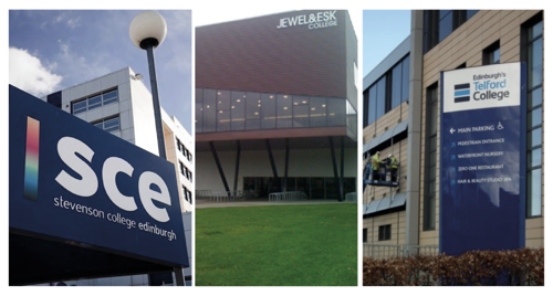
Edinburgh College was formed on 1 October 2012 as part of the merger of Edinburgh’s Jewel and Esk, Telford, and Stevenson colleges.
The College has four campuses, all of which were previously the campuses of the constituents of the merger:
- Granton Campus
- Midlothian Campus
- Milton Road Campus
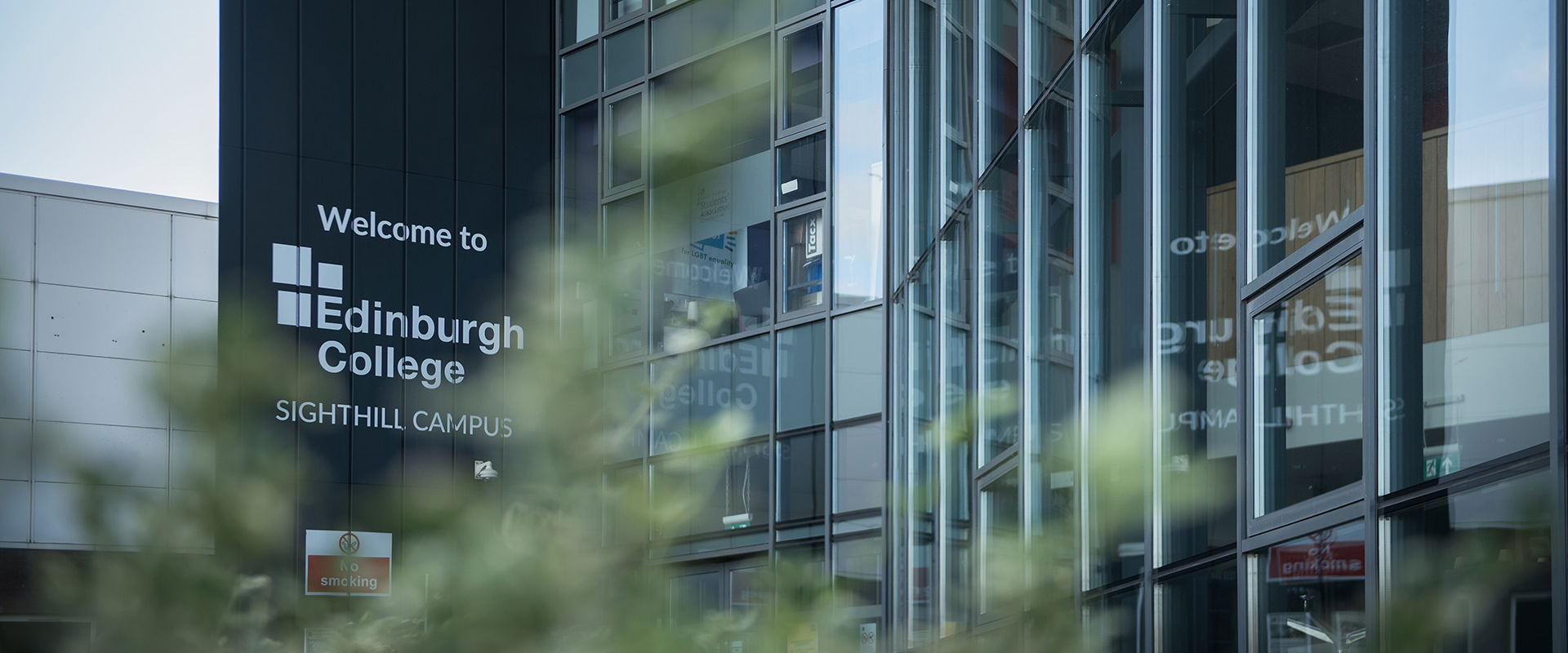
- Sighthill Campus
The first Edinburgh College logo was created in 2012. Using three blocks to demonstrate the merging of the three colleges. In 2016 and 2022, the brand was refined into its current form, introducing a cleaner, easier-to-use visual mark that aligns with industry standards.
Section 1 - Core Elements
The Edinburgh College logo is the College’s primary identifying mark. In this section will explore how the mark should be presented and its main components.
The Edinburgh College logo, in its purest form and the version that should be used as the default, comprises the brand name, ‘Edinburgh College’, the brand colour, navy, and the College’s signature three-block icon.
See the Variations section to see alternative configurations of the Edinburgh College logo.
Make sure to give the logo plenty of breathing room.
Use the top left block of the logo as a visual gauge - give at least this much space on all sides of the logo. Do not have the elements of the logo directly touching other elements, such as text or graphical elements.
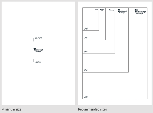
When placing the logo on screen or on an A4 sheet of paper, make sure the ‘Edinburgh College’ text is clearly readable. For printed documents, the minimum width is 26mm; on screen, it is 60px.
The same overarching principle applies to all paper sizes: ensure the text is readable.
Where possible, please use the default version of the Edinburgh College logo. However, there are instances where it is more appropriate to use a variation of the logo.
In locations where the brand has already been established, the icon variation can be used to make an additional nod to the brand. This is typically used on social media posts where the brand is already enforced through the social media account name and profile photo. It can also be used in PowerPoint presentations where the brand has already been stated on earlier slides. The icon can also be used as a background shape.
The single-line variation should be used when there is insufficient vertical space to use the default logo. This typically applies to document footers and in compositions that do not allow for adequate vertical space.
The logo variations are also available in white.
The Edinburgh College logo should not be changed or tampered with. For a business to be effective, the logo must be instantly recognisable. Altering the logo in any way dilutes its effect and makes it less recognisable and less trustworthy. A strong, consistent corporate brand fosters loyalty and enhances the College’s reputation as a credible institution.
Examples of incorrect use include:
- 1 and 2. Never stretch the logo.
- 3. Never recreate the logo.
- 4. Never rotate, skew or distort the logo.
- 5 and 6. Never alter the colour of the logo or apply effects to it.
- 7. Never place the logo on elements that render it unreadable.
- 8. Never outline the logo or any elements of it.
- 9. Never change the layout of the logo elements.
- 10. Never add elements to the logo within the minimum clear space area. Never add words or create sub-brands without approval from the College’s Marketing Team.
- 11. Never use an old version of the Edinburgh College logo. Only use the versions specified in this document.
- 12. Never use or reference logos from previous incarnations of Edinburgh College, pre-merger.
Curved corners are a visual cue that identifies the Edinburgh College brand. They are used in the logo and in graphical elements such as buttons, photo blocks, and section dividers.
The designated curved corners are the top-left and bottom-right.
For example, the curved corners are a feature of the Edinburgh College logo. In the three blocks, there is a curved corner in each of the blocks. In the top left block, there is a curved corner in the top left corner. In the right block, there is a curved corner in the top right corner. In the bottom block, there is a curved corner in the bottom left corner. Additionally, there is a curved corner in the bottom left corner of the ‘E’ in ‘Edinburgh College’.
Curved corners are used throughout our materials, including on buttons, photo blocks and section dividers.
Edinburgh College’s strapline is: ‘For the future you want’. Edinburgh College impacts the future of Edinburgh and the Lothians as an educational force, shaping the future workforce, fuelling the economy, and providing opportunities for the community.
The strapline is used in conjunction with the logo and other information where appropriate.
It is primarily used in flagship brand materials and corporate documents.
Edinburgh College’s brand font is Lato. It is used for the promotion and services of the College.
Lato is free to download via Google Fonts and should be used across all College materials. It is downloaded with various font weights from thin to heavy.
Where Lato is unavailable, Arial should be used as a suitable alternative.
The brand palette comprises Edinburgh College Navy, complemented by its accent, Edinburgh College Blue. The two main colours are supported by a dark blue and three greys.
It’s typical for differences in device or medium to create colour alterations. For example, colour will appear differently on a mobile screen and on paper. To reduce these differences, refer to these colour values.
To additionally reduce alterations, avoid colour picking from documents and manually input values.
When creating materials for screen viewing, use RGB values. When creating materials for printing, use CMYK values. When defining a colour for a web page, use the HEX code.
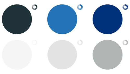
EC Navy
- R33 G51 B58
- C85 M61 Y53 K60
- HEX #21333A
EC Accent Blue
- G36 G114 B182
- C84 M48 Y3 K0
- HEX #2472B6
EC Supporting Dark Blue
- R0 G48 B120
- C100 M84 Y29 K10
- HEX #003078
Grey Light
- R246 G246 B246
- C5 M4 Y4 K0
- HEX #F6F6F6
Grey Medium
- R227 G227 B227
- C13 M9 Y11 K0
- HEX #E3E3E3
Grey Dark
- R177 G180 B182
- C34 M23 Y25 K4
- HEX #B1B4B6
The term “accessibility” refers to making our materials available to everyone, including those with disabilities.
Edinburgh College, as a public sector body, has a legal obligation, under the Equality Act 2010, to eliminate discrimination, advance equality of opportunity, and foster relations between people of differing characteristics under the Public Sector Equality Duty.
In addition to the Public Sector Equality Act, the UK Government brought in the Public Sector Bodies (Websites and Mobile Applications) (No.2) Accessibility Regulations 2018. These regulations state that websites and mobile applications must meet the WCAG 2.1 AA standards for accessibility.
When creating materials, please consider their format, distribution, and how users will interact with them.
The WCAG accessibility standards state their Four Principles of Accessibility: perceivable, operable, understandable, and robust. The Edinburgh College website must include content that meets the four principles, and it also lays the foundation for how users of any Edinburgh College-produced content should interact with it.
When creating branded content, please consider colour contrast, font size, and writing style to ensure compliance with accessibility guidelines.
Edinburgh College Logos
Edinburgh College Campus Imagery
Contact us
If you have any questions or would like to collaborate please contact us.
marketingteam@edinburghcollege.ac.uk